Take yourself back to when you were a child. Imagine you are at the Epcot theme park at Walt Disney World. You walk and start seeing surreal decor, roller coasters themed with your favorite TV show and movie, you look down and see that there’s a Mickey Mouse logo engraved on the manhole cover, the music plays at the perfect volume, there is a unique and pleasant smell, trash cans are dissimulated within the decor. Everything has been designed and thought of to perfection.

Yet when Walt Disney opened the amusement park in 1965, it was not immediately successful. He decided to improve the environment by focusing on the humans going to the park. For him, Walt Disney Park was not only an entertainment service provided to families, it was a whole experience. Walt Disney would walk around the amusement park to put himself in the position of a child. He was able to find opportunities to improve every single detail to create a unique and optimal experience by experiencing the park himself. That is the essence of User Experience Design: adopting a user-centered mindset to create an optimal experience.

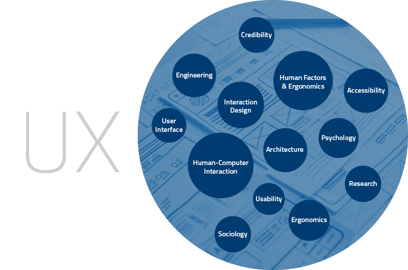
User Experience Components

Blog UX

UX design was being done unofficially for decades without most people even noticing. Walt Disney and Steve Jobs didn’t even know they were doing UX design. That is mostly because UX design is a mentality before being a discipline. Anyone can incorporate a UX mindset into their work routine. But in recent years, as particular importance was given to how humans interact with products and services, UX design gained popularity and has become a trend. The first official job title, User Experience Designer, dates back to the mid 1990s. Since then, the popularity of UX design has been growing with the evolution of technology.

UX design encompasses everything that a user encounters while using a product or a service. A single element can jeopardize the entire experience. The elements of an experience unite many different people in an organization. Specialists of all kinds have to be involved in the process of building a user experience. As we can see in the figure below, various fields create an optimal user experience.

APPLYING UX DESIGN TO TECHNOLOGY

UX designThe user experience comprises elements that relate to the senses, memory and perception. Called ‘human factors,’ they greatly influence the user’s opinion and likelihood of enjoying the experience. These human factors are a key element to focus on to ensure the usability of a product.

When user experience was not the design field as we know it today, companies studied human factors and ergonomics. Within the three types of ergonomic research (physical, cognitive and organizational), the study of cognitive ergonomics was one of the most important. During the third industrial revolution, particular attention to technology arose when people understood that there was a relationship, almost like a conversation, between humans and machines. As a result, the field of Human-Computer Interaction (HCI) was created to study the combination of human behaviors and cognitive ergonomics in relation to technology.

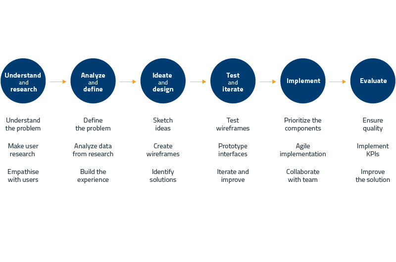
Overview of a UX design process

Blog UX

We say that HCI was the forerunner of UX. Even if they present some differences, HCI and UX encompass the study of similar fields. Today, UX has become a common and popular term within companies and product design, whereas HCI is mostly related to education and academics. With the countless number of products and studies that exist, UX design and HCI are both necessary and they both hold an important place in our world.

As the importance of UX continues to grow, OPTEL believes that it has an important role to play in our product development. To design the best user experience, we must understand our users and their use of software.   plays an essential role in shaping the interaction between humans and software, taking into account how the user’s brain works to ensure the user intuitively understands the software. This requires a UX design process, which can be applied to a new or existing product. Going through several phases, the process leads to a solution that diminishes potential frustrations, solves a problem, helps users in their daily usage of the product and much more.

Several design processes can be applied, but at OPTEL, we believe that there is not a fixed and single process that can be applied to all of our products. This means that a design process needs to be adapted to each product that is built or improved.

For instance, the steps below are a chronological representation of the steps that a UX designer usually goes through. Some steps might take longer than others depending on the product, and some steps go back and forth to ensure the quality of the process.

What is important and valued with these UX design steps is that understanding and researching come before designing. This discovery phase allows us to get to know the users and customers as well as understand the problems to solve and the needs to fill. Basing the process on users’ needs and understanding of the problem highly diminishes the risk of ending up with an inaccurate solution.

Throughout the steps, the ideas, the wireframes and the prototypes are tested with potential or actual users to ensure the path of creating or improving a product or service is aligned with users’ needs. This is called User-Centered design. Everyone at OPTEL is encouraged to adopt a user-centered mindset to create solutions that are optimal for our customers; it is at the core of our values.

We strive to offer products and services that offer an optimal user experience. It is important for a company to know their users in order to build software and hardware that is not only usable but also  easy to use. At OPTEL, we work toward getting closer to our users and customers by getting to know their needs and understanding how they use our products. Our goal is to develop products that offer a Walt Disney experience adapted to software designed with humans in mind.

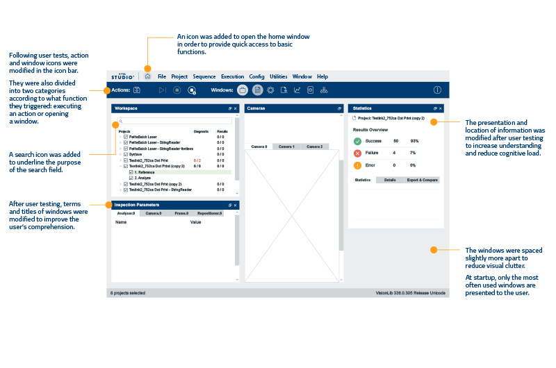
UX mockup

UX IS IN THE DETAILS

As an example of how we integrate the user experience in our software, we decided to review the main interface of a software program created at OPTEL. We noticed usability problems in an internal program our employees use. This software is used to test and improve quality and reliability on our PharmaProof cameras. Since we care about our internal users as much as our external users, we wanted to review the user experience performances of this software to improve the usability and enjoyability for our employees.

This interface is the new version that was redesigned following the design process. The contextual comments explain some modifications that were brought to the interface.

THE PROCESS

To clearly understand the problems that users encounter, we decided to use various design methods. Among other steps, we asked some current users to show us how they use the software in their daily tasks. To better understand their reality, we combined the Shadowing and Think-Aloud Protocol methods. Sitting next to the participant, a UX researcher observed the interactions between the user and the software while collecting in-context verbal feedback about  needs, frustrations, misunderstandings and usage of features.

We then used the Task Analysis method in collaboration with users to determine the different uses of the software. We were able to identify five user flows that helped us understand when the pain points occur. As we wanted to make sure we didn’t miss any relevant information before going forward in the design process, we conducted structured interviews during which we asked specific questions to complete our research. These methods helped us identify the main problems that users encounter and gave us an idea of the parts of the software we need to focus on.

As we compiled the results, one of the concerns we wanted to address was the iconography. The user interface was not our priority, but we discovered that one of the usability problems was confusion around the meaning of icons. There was an icon navigation bar, but very few of the icons were used. Since there are many different functionalities in the software, the navigation bar was needed as a shortcut to work more productively.

We decided to use the Card Sorting method that we adapted to an Icon Sorting method. Participants were asked to associate action words to an icon from a bank of various icons. This method helped us understand the meaning of specific terms in the software for users and clarify some terms that were confusing to them. From the insights we gained with the Icon Sorting method, we proceeded to an icon redesign, which reduced the execution time of tasks since. Several other changes were also made, which are presented in the interface below.

Contact Us